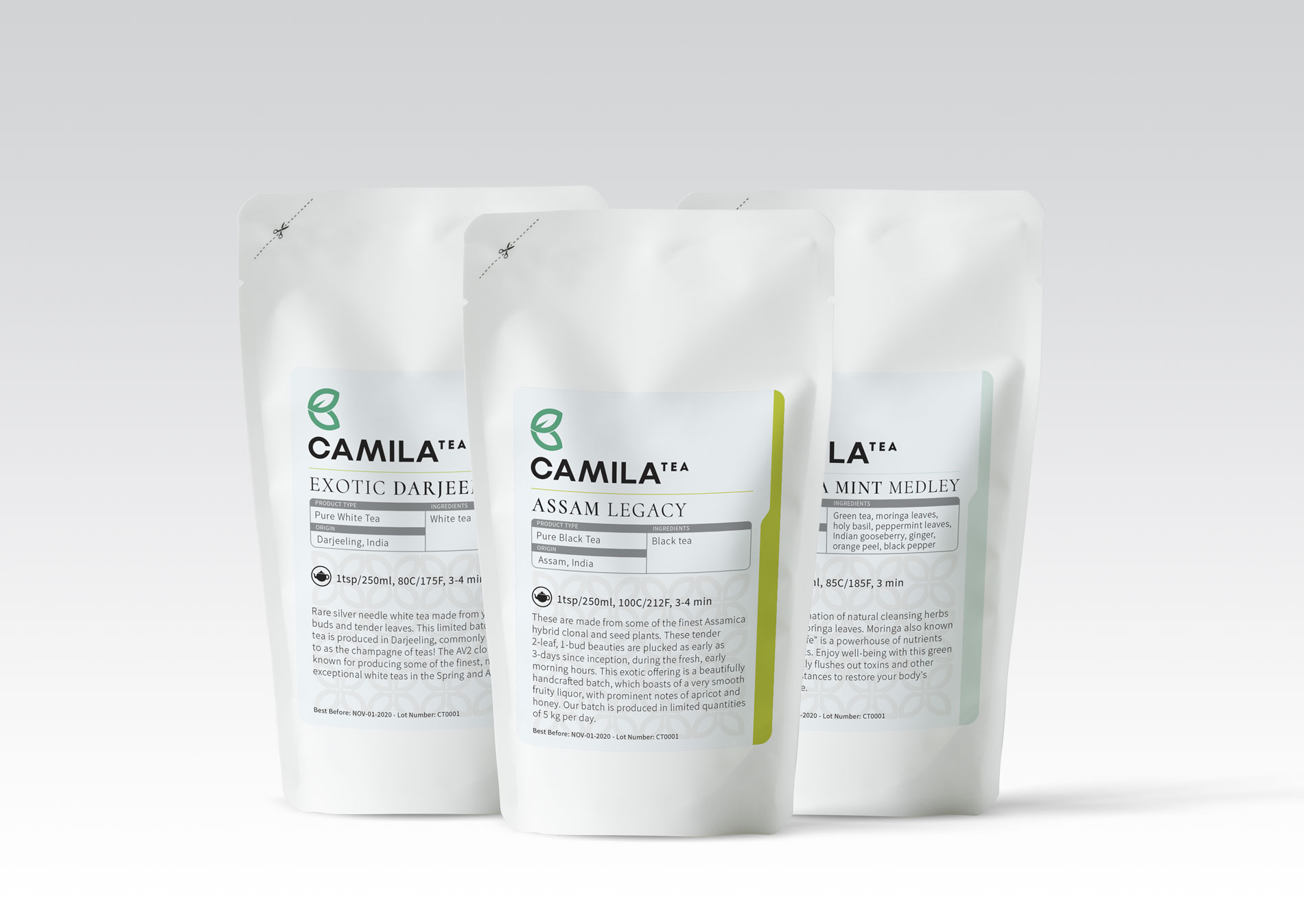
Camila Tea
When Colin, from Camila Tea got in touch, he was clear that he was passionate about Tea. He was clearly invested about Canada getting great quality tea, through his company. For us, being from India, tea is ancient, pristine. And good tea always possesses a clarity of its flavour and heritage. Design was oriented only to simplicity, clarity and classiness. Exactly like the tea that Camila Tea was procuring straight from organic, artisanal farmers in India. No middlemen, good margins to the farmers, and so it was easy for us not to compromise, even a smidgin, on how clearly this brand was portrayed to consumers in Canada. The process was smooth – an in-depth meeting to understand what the client was feeling and where they saw themselves, saw a strong, yet feminine design evolving.
What we loved about working with this client: He was always ready to share other ideas and thoughts that he was impressed by, and ask questions about many components of the process, but totally willing to see the sense in what Paul was trying to accomplish. When there is a hunger to make things better – with an open and transparent approach – communication is better, understanding is clearer and of course design always benefits from this!
ClientCamila Tea, CanadaServicesBrand identity, packagingYear2019


